Salford received its town charter from Ranulf de Blondeville, 6th Earl of Chester, then Lord of the Manor, in 1230. However, it did not receive borough status until 1844, the result of local government reforms embodied in the Municipal Corporations Act of 1835. This was followed by its elevation to county borough by the Local Government Act of 1888. It was granted city status in 1926. On the 1st of April, 1974, the City and Borough of Salford joined the metropolitan county of Greater Manchester.


The arms, designed by H. Ellis Tomlinson, combine elements of the five local authorities that formed the new city of Salford in 1974.
The shield retains were approved by letters patent of the Garter King of Arms and based upon the former Borough of Salford arms; the blue background with a gold 'chief', giving the heraldic colours of the Earls of Chester, from whom Salford received its first charter in 1230.
Also from Salford are the gold shuttle and five bees, representing the growth of five industrial communities round a centre of the textile industry, and the two black millrinds (the iron centres of millstones) as symbols of engineering.
The ship motif comes from Eccles and signifies the importance of waterways in the area. The crest, a red-half griffin holding a flag staff with a pennon, with three boars heads, is one of the former Eccles supporters. The boars heads were also seen in the Irlam arms, and the circle of steel around the griffin's neck was part of the Irlam crest, symbolising the town's great industry.
The supporters'-lions brandishing miners' picks are similar to those of Swinton and Pendlebury. Each lion is collared with a steel chain (a further symbol of engineering) holding a white pentagonal medallion. On one medallion is the black pheon, or broad arrow, which, with the red lion, appeared in the arms of Worsley, whilst on the other is the boar's head from the crest of Swinton and Pendlebury, shown in that former borough's livery colours of red and gold.
The motto, already described, is that formerly used by the Borough of Swinton and Pendlebury, Salus populi suprema lex ("The welfare of the people is the highest law").
In addition to its coat of arms, Salford City Council has its own "up-beat and highly visible" magenta-coloured logo.

Seal of the Hundred of Salford
In 1436, King Henry VI granted Sir Richard Molyneux of Sefton the office of Steward of the Wapentake of Salfordshire, to descend by hereditary right. This office was passed on through the Earls of Sefton until 1972.

Old University of Salford Coat of Arms

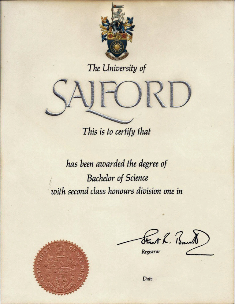
Arms seen at the head of a degree certificate and on its seal (1976)
New University of Salford Coat of Arms

A grant of Arms, Crest and Supporters was made to the University of Salford by Letters Patent of Garter, Clarenceux and Norroy and Ulster Kings of Arms dated 6 January 2017. On 10 February 2017 at Maxwell Hall, Salford, the Letters Patent were presented by Timothy Duke, Norroy and Ulster King of Arms, to the Chancellor of the University, Professor Jackie Kay, Makar or national poet for Scotland. An animated video on the new design can be seen here.
The Arms are blazoned:
Sable above a demi Sun issuant in base Argent charged with a demi Rose likewise issuant Gules barbed and seeded proper a Chain fesswise throughout enhanced and enarched and a Chief embattled and enarched Argent.
Crest: Upon a Helm with a Wreath Argent and Sable A Lion passant guardant Gules armed langued and resting the dexter hind paw on a Shuttle fesswise Or and supporting with the dexter forepaw a Fire Beacon Sable enflamed proper tied to the pole thereof by a knot at the mid point of its length and flying to the sinister a Riband party lengthwise Argent and Sable Mantled Gules lined Argent.
Supporters: On either side a Heraldic Antelope Sable attired langued and tufted Gules teeth Argent unguled and charged on the shoulder with a Bee volant Or and resting the interior hind foot on a Mooring Bollard Gules wound round with a Rope Or all upon a Compartment comprising a Quayside of grey stone setts issuant from Waves of Water proper.
College reference: Grants 180/72.
Source: College of Arms, April 2017 Newsletter (no. 50)
We stand at a pivotal moment in the long history of our university, a fork in the path that offers two ways forward. One is to follow the business model of higher education to its logical conclusion, in a competition for students, research funding and ratings that values constant change as an end in itself. The other is to rediscover the civic purpose of the university as a necessary component of the constitution of a democratic society, with the responsibility for educating its citizens and furnishing them with the wisdom and understanding that will enable them to fashion a world fit for future generations to live in.

No comments:
Post a Comment